Omaha, NE, USA, 1937 . Lives and works Los Angeles, CA, USA
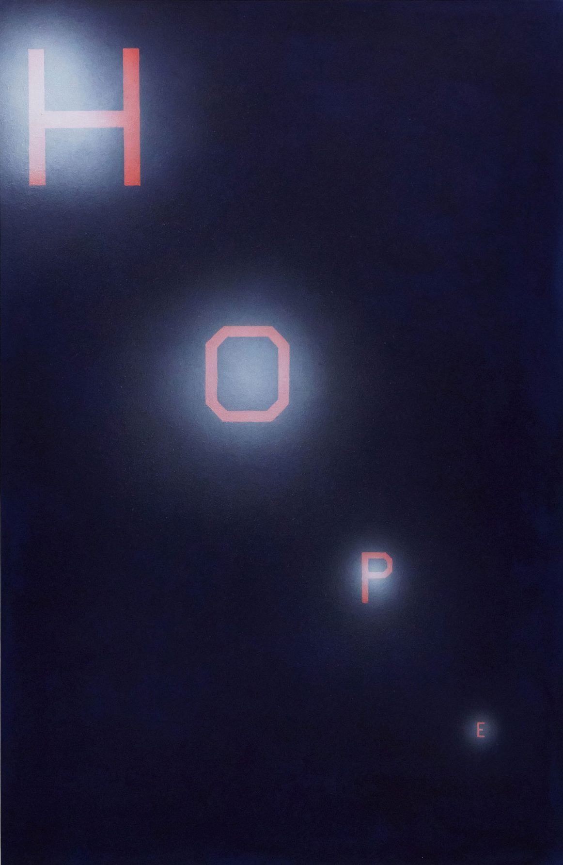
Hope, 1986
Dry pigment and acrylic on paper
58 X 37.64 in

Ed Ruscha worked as a designer for the Carson-Roberts advertising agency in Los Angeles before dedicating himself fully to his career as an artist, in which he explores visual language, popular culture and the West Coast lifestyle, specifically that of Hollywood.
Phrases and words first appeared as central themes in his paintings in 1959, influenced by his training in the advertising world and as a symptom of the growing skepticism toward words and their meanings that was emerging at that time, as exemplified by authors like Michel Foucault. Thus, his work explores and questions language, which he no longer saw as a neutral tool and began to think of as another medium to be manipulated.
In Hope, Ruscha uses a typeface of his own design, called “Boy Scout Utility Modern,” based on the Hollywood sign. This piece refers directly to the famous part of Los Angeles. The interpretation that results is ambiguous, since the letters are not linked to real objects and do not evoke anything specific, which sets their meaning adrift. Nevertheless, with Hope Ruscha conveys a certain irony and humor by establishing a parallel with the Californian sign and especially with the meaning given to it by the people who move there in pursuit of the American dream.